Applying Psychology to Building Products in Everyday Life
Issue 36
4,000+ smart, curious folks have subscribed to the growth catalyst newsletter so far. If you are new here, receive the newsletter weekly in your email by subscribing 👇
In 1930, a psychologist at Harvard University called B.F. Skinner made a box with a lever and placed a rat inside it. As the rat moved around, it would accidentally knock the lever and, when it did, a food pellet would automatically drop into the box. Over time, the rat learned to go to the lever and press it: the reward made the rat learn this behavior. Skinner proposed that the same principle could be applied to humans. He called it operant conditioning, through which a voluntary behavior is modified by reward or punishment. This box with a lever became known as the Skinner box.
Gambling casino operators were among the first ones to use the operant conditioning principles for profit. They carefully designed casinos optimizing the physical environments, slot machines, unpredictable reward systems to get a number of players in a zone where they push buttons without caring much about anything. Some of these players are so absorbed that they urinate in cups so as not to break the flow. Unfortunately for the casinos when you leave the casino, you leave their Skinner box.
Though casinos don’t affect everyone, elections do. Almost a century later in 2013, Robertson worked under the supervision of Epstein, B.F. Skinner’s last doctoral student, to begin a series of behavioral experiments to address an unsettling question: Could a search engine be used to sway the minds of voters?
In an article titled “The 21st Century Skinner Box”, Robertson wrote about his findings.
The idea was simple. You can influence someone’s decisions based on the order in which you present the information. In the digital world, controlling the presentation of information becomes even easier. By arranging information, web-based platforms can influence which hotel you book, the music you rate, and, the emotional language you use on social networks.
So what would happen if people were exposed to biased search rankings—search results arranged to favor one political candidate or another?
As most of my readers live in India, you will certainly relate to it. They conducted one of the experiments on real, undecided Indian voters in the midst of India’s 2014 Lok Sabha elections, the largest democratic election in history.
On average, they were able to shift votes by 20 percent or more, with shifts as high as 72.7 percent occurring in some demographic groups (e.g., unemployed males from Kerala). But the biggest shock was that 99.5 percent of subjects in the India experiment showed no awareness of the experimental manipulation—the biased search rankings.
As most elections are won at a narrow margin, a 20% shift would mean changing the outcome of the whole election. It goes on to show the powerful effect of social media and search engines on our lives.
Robertson called this phenomenon the Search Engine Manipulation Effect (SEME) and published the findings in the journal Proceedings of the National Academy of Sciences. An example of social media influencing elections is the US still investigating the impact Facebook had on their 2016 presidential election results.
We don’t need to think of as one-off things that come once every four years like elections. One could say that the daily apps we use are a lot like digital Skinner boxes. They provide you with a sense of control. But they also influence your thoughts and choices. Examples could be the gamification of work that keeps Uber drivers on the road longer than they would be otherwise or notifications from an addictive game that keeps bringing you back and wasting hours on a stretch. Most people appear to be unaware of the impact apps have on them.
Unlike behavior scientists of the past who used to do experiments on hundreds of participants, the apps have an enormous amount of data and they can use this data to conduct experiments on the fly — the shape and color of the buttons you press, the timing of each notification you receive, and the content of every piece of information that reaches you.
If you have read this post so far, you may be inclining towards the dark powers of apps. That is because of the way I have presented the information. This is why there is so much scrutiny around the big tech these days because the press writes the story I have written so far. But the skinner box is a form of magic that can be used both ways. More importantly, the apps we use every day have created a huge impact on the world.
Google and Facebook enable us to find information quickly, connect with like-minded people, and discover content that we’ll enjoy—saving us valuable time that we can spend elsewhere finding it.
Apps like calm and headspace have used notifications and reminders to get people to meditate on a regular basis, which helps them.
Education tech platforms have employed gamification tactics like points, badges, and leaderboards to help students learn more.
Running apps like Nike Run Club use gamification to give you a sense of achievement and build healthy habits.
However, we shouldn’t ignore the problems of Tech as well. In fact, showing the world that they can affect billions of users with the right accountability and transparency could be tech’s route to redemption.
Hopefully, I don’t need to convince you now on why PMs and growth teams need to learn user psychology. If one principle of behavioral psychology can create such an impact, both good and bad, we need to learn and understand this subject while designing products.
If I had to explain Psychology, the perfect analogy to the user psychology would be the ‘Force’ from Star Wars.
The Force is a mysterious energy field created by life that binds the galaxy together. Harnessing the power of the Force gives the Jedi, the Sith, and others sensitive to this spiritual energy extraordinary abilities, such as tricking minds, and seeing things before they happen.
We can use behavioral science to build successful products, or simply improve the odds of succeeding it. We need to understand what motivates customers: their needs, desires, hopes, fears, and frustrations. Behavioral psychology helps us understand that.
In the next 3 posts, we will cover interesting things around psychology.
Designing the right pages using principles of psychology (this one)
Converting users using principles of psychology
Retaining users using principles of psychology
Let’s now understand how to design the right page using the principles of psychology.
Designing the Right Page
There are two key ingredients of designing the right page — visual design and copywriting. The visual design includes elements like button placement, colors, layout, etc. Copywriting, as the term suggests, is the text you place on the page. As copywriting helps in conversions a lot, I will cover principles used in copywriting in the next post around conversion.
In this one, let’s discuss the principles that can improve the visual design
1. Gestalt Principles
The human brain is wired to see structure, logic, and patterns. It helps us make sense of the world. In the 1920s, a group of German psychologists developed theories around how people perceive the world around them. They are known as Gestalt principles. “Gestalt” is German for “unified whole”
For example, what do you see when you look at this image?
If you’re like most people, you see a triangle. Some of the gamers out there can see pac-men. We see the triangle because our brains see something that makes sense to us and that we understand.
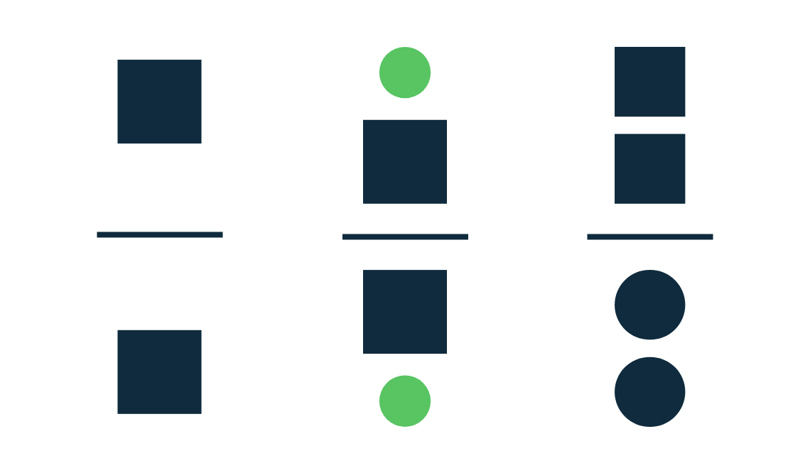
Figure-ground
The figure-ground principle states that people instinctively perceive objects as either being in the foreground or the background. They either stand out prominently in the front (the figure) or recede into the back (the ground).
Knowing this principle well, you can do usability tests to figure what stands out in front of your designs on a particular page.
Similarity
The principle of similarity states that when things appear to be similar to each other, we group them together. And we also tend to think they have the same function.
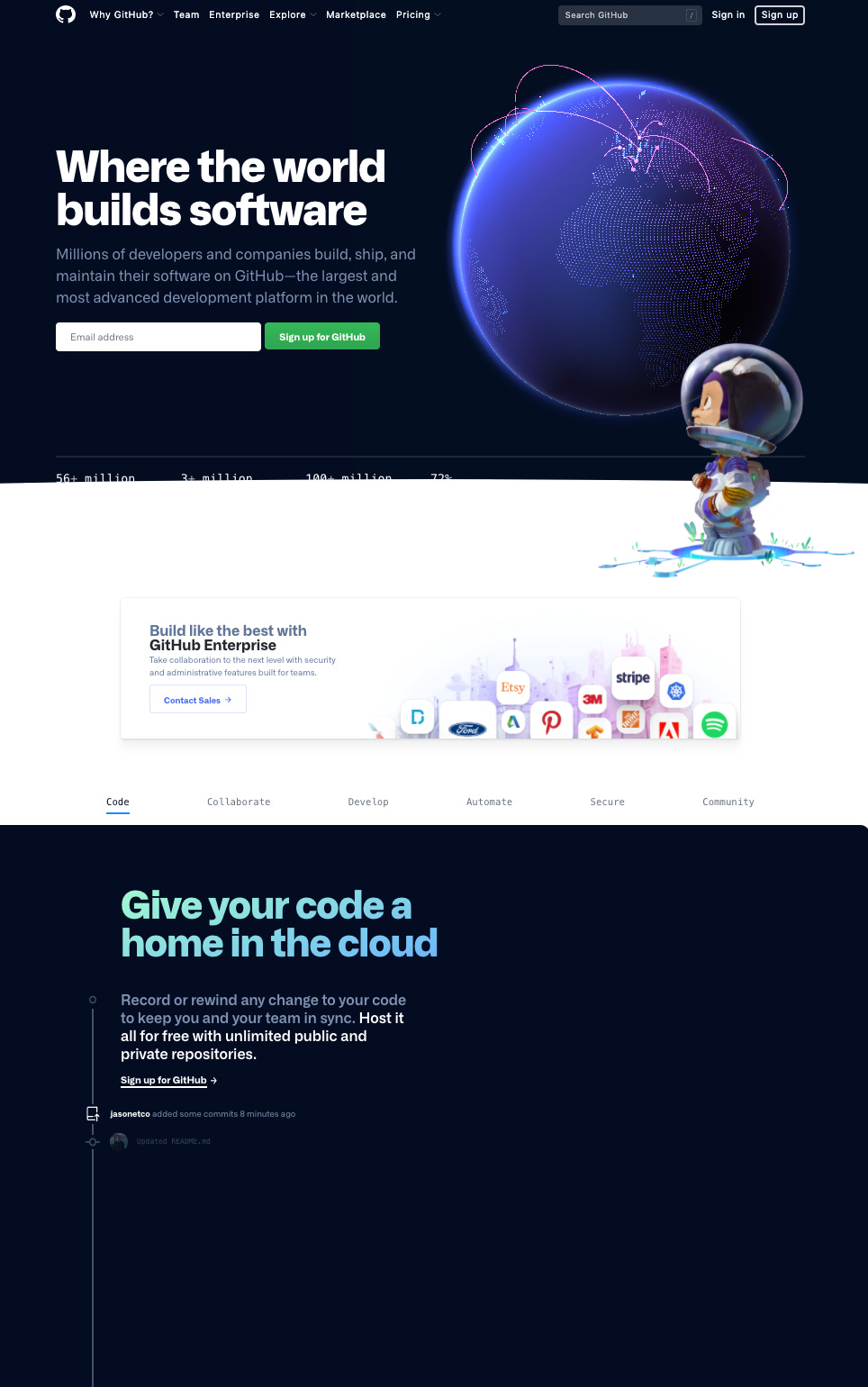
For example, websites use the similarity principle to distinguish different sections by putting them in different colors. They also use the color blue to distinguish links from regular text and green/yellow buttons to indicate call-to-action. See Github's different sections for example. We can use the principle of Similarity in navigation, links, buttons, headings, call to action, and more.
Proximity
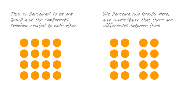
The principle of proximity states that things that are close together appear to be more related than things that are spaced farther apart.
Source: Andy Rutledge
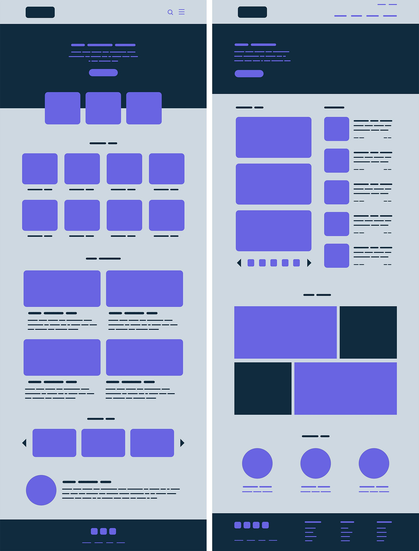
We can apply the Proximity principle pretty much everywhere from navigation, cards, galleries, and banners to lists, body text, and pagination. See an example of two-page structures, the second one uses the proximity principle to help users focus by putting similar things together.
Common region
The principle of the common region is highly related to proximity. It states that when objects are located within the same closed region, we perceive them as being grouped together.
The Common Region principle can hold together many different elements keeping them unified by the use of line, color, shape, and shadow.
Continuity
The principle of continuity states that elements that are arranged on a line or curve are perceived to be more related than elements not on the line or curve.
The linear arrangement of rows and columns are good examples of Continuity. We can use them in menus and sub-menus, lists, product arrangements, carousels, services, or process/progress displays.
Closure
The principle of closure states that when we look at a complex arrangement of visual elements, we tend to look for a single, recognizable pattern.
When presented with the right amount of information, our brain will jump to conclusions by filling in the gaps and creating a unified whole. This way we can decrease the number of elements needed to communicate information, reducing complexity and making designs more engaging.
We can use the Closure principle in Iconography, where simplicity helps with communicating meaning, swiftly and clearly.
Symmetry
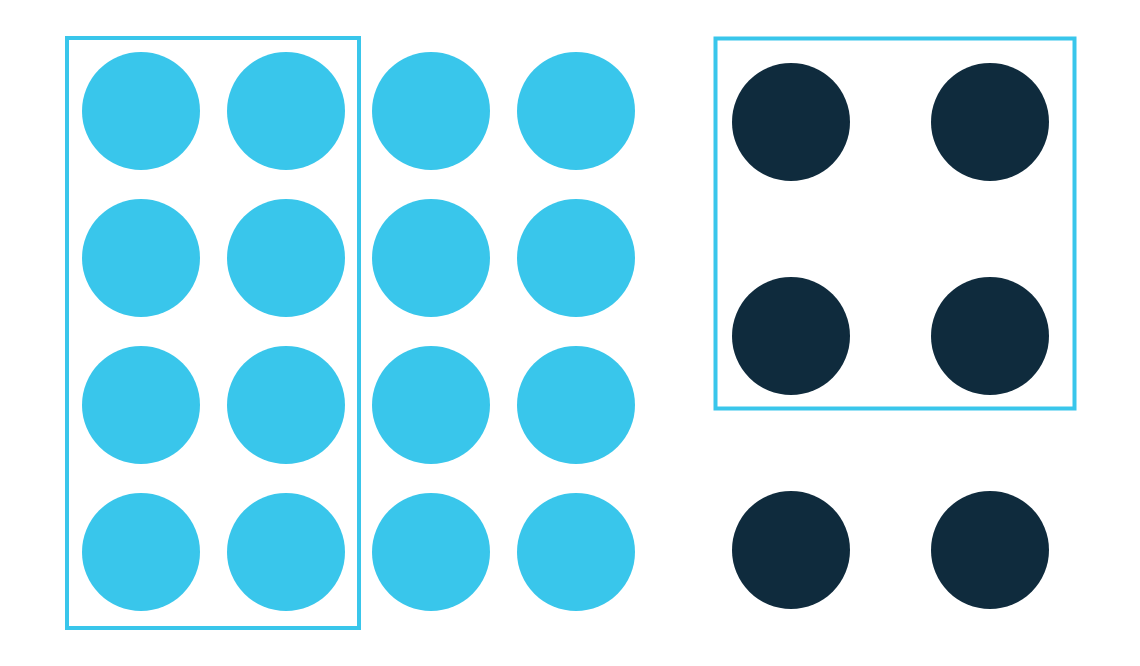
Symmetrical elements tend to perceived as belonging together regardless of their distance, giving us a feeling of solidity and order.
Symmetry can be used for galleries, product displays, listings, navigation, banners, and any content-heavy page.
Borrowed images and ideas from few great pieces on Gestalt principles, including this one 🙏🏻
If you are new to design as a PM or marketer, keeping Gestalt principles in mind will improve your design manifold.
2. Law of Least Effort, or Zipf's Law
Most people are inherently lazy, and if not lazy, want to do things efficiently. They want to take the path of least effort or resistance. This is called the law of least effort.
For example, people who want to order from a restaurant or to make a reservation will often look for a phone number but will give up if they can't easily find it prominently displayed on the landing page. If you operate a restaurant, put your phone number in the top right corner of every page on your site. And if you want people to email you instead of calling, make your email address highly visible instead.
If people can’t easily get the information they need (such as your phone number to make a restaurant reservation), they take the path of least resistance and move on to a competitor or another option.
3. Perceptual Selection
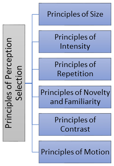
Perceptual selection is individuals focussing on certain elements instead of others. What makes people focus on certain elements and not others. There is a good overlap between Gestalt principles and perceptual selection. The basic principles of perceptual selection are
1. Principles of Size
Generally, the bigger is the size of the button, the higher is the probability that it attracts the attention of the user. Similarly, letters of higher sizes in newspapers or books are first selected for reading.
2. Principles of Intensity
A loud sound, strong odor, or bright light are noticed more as compared to a soft sound, weak odor, or dim light. It is, for this reason, the CTAs like ‘add to cart’ or ‘buy now’ are made of bright colors.
3. Principles of Repetition
Repetition increases people’s sensitivity or alertness to the stimulus. Advertisers use this principle by repeating advertisements of the same product to attract people’s attention.
4. Principles of Novelty and Familiarity
Either a novel or a familiar external situation can get the attention. New objects or events in a familiar setting or familiar objects or events in a new setting draw better attention.
5. Principles of Contrast
Something which stands against the background, or which is unexpected receives more attention. People wearing purple shoes get more attention :)
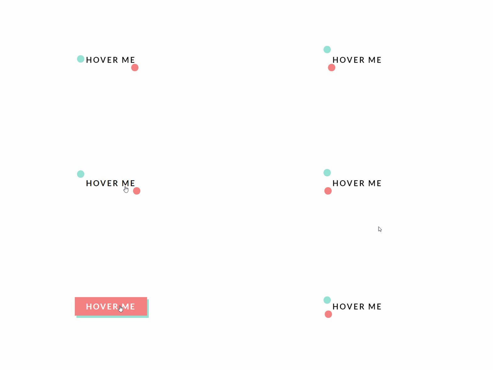
6. Principles of Motion
A moving object draws more attention as compared to a stationary object. An icon that moves when the user comes to the page will get the attention of the user.
To apply these principles, on every page you should ask what you want your users to do and then use the principles of perceptual selection to highlight those actions.
4. The Aesthetic-Usability Effect
Users are more tolerant of usability issues when they find an interface visually appealing. This aesthetic-usability effect can mask UI problems and can prevent issue discovery during usability testing.
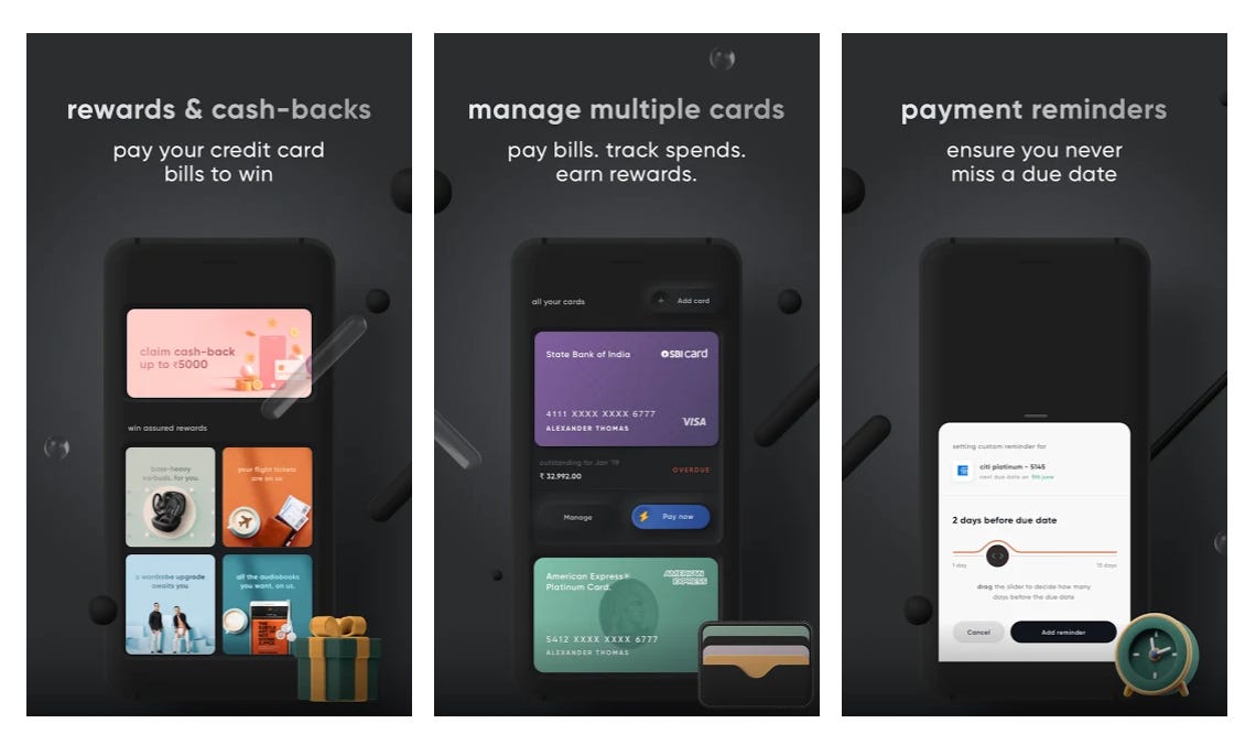
Ever wondered why many people love the Cred app despite several usability issues. It’s the aesthetic-usability effect at play there.
5. Competing pressures model
Another interesting theory from Psychology is the Field Theory developed by Kurt Lewin. He mentioned that human behavior is influenced by two pressures:
Promoting pressures — reasons to do something
Inhibiting pressures — reasons not to do something
As Product Managers, we often focus on promoting pressures by telling people about the benefits but not enough on reducing friction.
For example, making payments easier by adding more options almost always improves conversion because it solves for inhibiting pressure in a transaction. An interesting derivative of this theory is the Psyched framework written by Darius Contractor.
6. Cognitive Load or Hick’s law
Hick’s Law is a psychological concept that says people will take a longer amount of time to decide if they have more choices. When people have to make decisions and are presented with a lot of information, they have to think, and this raises cognitive load. Therefore, it makes more sense only to present a limited number of choices at any given time as users advance through your interface.
An example of this is Amazon doing it with ‘1 click ordering’. Here is a good analysis by Wharton on why it was a gamechanger.
As many readers ask about books that have helped me build knowledge in specific areas, sharing that for behavioral psychology. My own interest in psychology started in college, and here is the top 10 list of books I can remember that have helped me. In descending order of importance, they are :
Thinking fast and slow
The Power of Habit: Why We Do What We Do in Life and Business
Man’s search for meaning
Predictably Irrational: The Hidden Forces That Shape Our Decisions
Nudge: Improving Decisions About Health, Wealth, and Happiness
The Design of Everyday Things - how people see and interact with the world
Hooked: How to Build Habit-Forming Products
The 22 Immutable Laws of Marketing: Violate Them at Your Own Risk
Atomic habits
In the end, I will conclude this post by saying this :)
Don’t move to the dark side 🙌
Sincerely,
Deepak
PS: If you liked this post and are liking the Growth Catalyst Newsletter so far, share it with friends or give me a shoutout on LinkedIn, Twitter. A little act of kindness will help reach this newsletter to those who can benefit from it 🙏🏻 😊
Much thanks to Pushpak and Aditi for pointing out some spelling mistakes. Somehow Grammarly got turned off while editing and I didn’t notice 🙏🏻






Lots of new information. Loved the way it's presented. Amazon's image made me open Flipkart app to check out add to cart and buy now buttons.
Most impressive is your style of writing.
Superb write up.