Decoding Growth: User Cohort Analysis
Forecasting User Growth Part 2/3
Good Morning,
In the last week’s post, we saw how usual MoM growth trends fail us. We also covered how to break MAUs into user segments and define useful metrics to decode growth.
This week, we will take decoding growth to the conclusion by discussing two methods — cohort analysis and distribution curves. Let’s start with cohort analysis.
Check out the other posts that I have written if you haven’t
2000+ people have subscribed to the growth catalyst newsletter so far. To receive the newsletter weekly in your email, consider subscribing 👇
If you aren’t familiar with the newsletter and online sessions, you can read about it here
Off to the topic,
Cohort Analysis
A cohort is a group of people having something in common. As we are talking about growth, the cohort refers to people who did <x> in the product in the same period. For example, a July’19 cohort can be people who used the product for the first time in July’19.
Cohort analysis is looking at different cohorts’ behavior over time to see if something has changed. For example, suppose users who joined recently are behaving differently from the users who joined last year. In that case, we should find why it’s changed and do something about it.
We usually measure growth in three different ways — users, time spent, and revenue. We will cover how, including all these three in analysis, it helps us find deeper data patterns.
Let’s start with the first one, users. Here we look at the retention of different user cohorts over time.
User Retention of Cohorts
A retention plot of user cohorts starts with month0, i.e. the month in which the user came to the product for the first time. M0 retention for any cohort is ~100%. So an Apr’19 cohort means that the user came to the product for the first time in Apr’19. For this particular cohort, month1 will be May’19. Month2 will be June’19 and so on…
What about the Jun’19 cohort? Month0 will be Jun’19. Month1 will be Jul’19 and so on…
To create a user cohort retention curve, we pick the x-axis as months after acquisition (i.e. age of the cohort); the y-axis tracks the monthly retention. Each line in this curve represents a different monthly cohort.
Looking at this cohort lines, we can infer Month12 retention of users who joined in Apr’19, May’19, and Jun’19. What we can see is that M12 retention of Jun’19 is higher than Apr’19. So that means the long term retention is increasing.
We also look at whether the retention curve for different cohorts is flattening at one point. If the retention curve doesn’t flatten at any point, it will eventually become 0%. This kind of retention curve that becomes 0% at one point isn’t good as it works as a leaky bucket for growth. As none of the users of one cohort retain in the long run, we have to keep spending money and adding new users to make up for all the users lost.
Suppose the retention curve flattens at, say 20%. In that case, we know that for every 100 users coming to the product, 20 of them will keep using the product for a long period(loyal). These loyal users keep adding up over time and create a huge base.
We will talk more about it in some of the Growth Catalyst's future topics like retention and growth projections.
Customer retention cohorts are similar to user retention cohorts. Month0 for customer retention cohorts is assumed to be the month customer purchased for the first time.
Revenue Retention of Cohorts
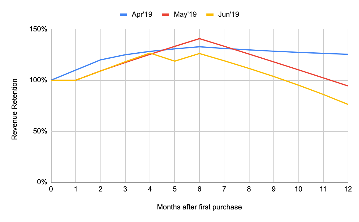
The next graph is revenue retention. The revenue retention plot also starts with Month0, i.e., the month in which customers made the first purchase. For that reason, M0 retention of a cohort is ~100%.
Let’s take an example of the Apr’19 cohort. Users in this cohort made their first purchase in Apr’19. Say the total revenue made from the Apr’19 cohort was $1000. We will check the total revenue made from this cohort in next month (May’19). Say the total revenue for the cohort in May’19 is $800. So the M1 revenue ~$800 and M1 revenue retention ~ $800/$1000 = 80%.
A major difference between user and revenue retention is that revenue retention can be > 100%. Revenue retention > 100% happens when a user spends more money in later months, compared to their first month.
As we can see in the chart above, revenue retention has reduced significantly for the Jun’19 cohort.
Just like revenue retention, we can plot engagement (time spent) retention too.
The next chart is a variation of revenue retention. The chart is looking at the life-time value of cohorts. The lifetime value of a cohort is defined as the total revenue generated by a cohort during its lifetime.
Usually, if the revenue retention is falling, we assume that it’s a bad thing. A cohort with lower revenue retention may have a higher lifetime revenue. This is why we need to see the lifetime value of cohorts.
Life Time Value of Cohorts
LTV chart is an interesting one. For this graph, customers have been grouped together in cohorts by the month they first paid revenue to the company.
You can compare this chart and the revenue retention chart. Even if the revenue retention chart of Jun’19 cohort is worse than May’19, the LTV of Jun’19 is better than that of May’19. How does it happen?
As you may observe, the M0 revenue for Jun’19 is pretty high compared to May’19. As revenue retention is calculated with M0 revenue as a denominator, the graph for Jun’19 looks worse.
The key thing to look over in LTV of cohorts is the shape of the cohort lines.
If the cohort lines curve upwards, that means customers actually spend more as they grow old. This is a pretty good thing for a business and can be used to justify the high upfront cost. Ex - Apr’19
If the cohort lines are straight, there isn’t much change in spend MoM. Still better than the next one.
If the cohort lines curve downwards, that means customers are spending lesser as they grow old. This is the case in the Jun’19 curve shown above. It’s worrisome and the growth team should do something about it.
Another Way to Visualize Cohorts
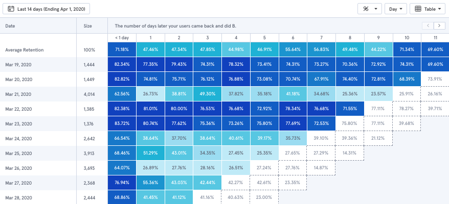
If you have used tools like Mixpanel, you may have come across this kind of retention table.
In the retention table, the size of the cohort for each date is present, and daily retention for 11 days is also present. This table is also color-coded like a heat map, where the color gradient is used to represent how good or bad the retention is.
This table's benefit is that it is easier to read, especially when you are trying to draw retention cohorts for a long period.
You can draw the same table for all the 3 different charts described in the sections above. A sample LTV heat map will look something like this
Distribution Charts
You might be familiar with the frequency distribution chart. It summarizes values and their frequency. For example, if I have to plot users’ engagement by the total number of days they were active in a month, I can use a distribution chart.
A histogram is the most commonly used chart for visualizing distribution, where we display data using bars of different heights.
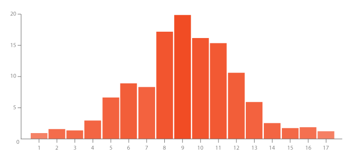
Let’s try to build a histogram to plot users’ engagement by the total number of days they were active in a month. This is pretty useful in analyzing user engagement and also know as a power user curve or L30 distribution.
Power users are very loyal to your product and use it more frequently than others. L30 is called a power user curve because it can help you figure out what % of your monthly active users are power users.
This is how a typical L30 curve looks like,
There are multiple reasons to love this chart:
It shows if you have a loyal segment that’s coming back every day. We see from the chart above that around 4-5% of all users come more than 10 days a month.
It shows the variability among your users: some are slightly engaged, whereas others are power users. Contrast this with other measures of engagement like time spend or DAU or MAU. A single number like these doesn’t give you a lot of information. The L30 chart on the other hand does.
When we plot the L30 curve for multiple cohorts, we can see how it is changing with time.
Now let’s ask another question, is there a better way to plot the L30 curve? Looks like there is. It is easier to read as a Cumulative chart. In a cumulative chart, we plot the cumulative distribution. Here is how you calculate cumulatively
So when we draw the cumulative chart for the L30 curve, here is how it looks.
In this chart, we can quickly read that around 95% of users are active <10 days a month. Around 70% of users are active < 5 days a month.
What about revenue? Can we apply the same to revenue?
Distribution Charts for Revenue
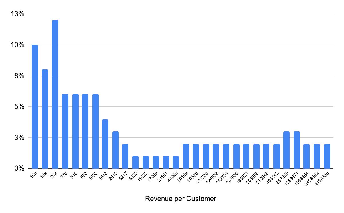
We can definitely start by plotting a revenue distribution chart. It is better than a single metric like average revenue per user (ARPU).
Please note: Because of the wide range in revenue per customer ($100- $10,000,000), we have used a log scale on the x-axis.
Do we really see such diversity in revenue per customer? In B2C businesses, we don’t. But in B2C we do see such diversity. Take Salesforce as an example, some startups pay <$1000 to Salesforce but some of the fortune 500 companies might be paying millions of dollars.
We can convert the graph above to a cumulative graph like the one here. It is easier to read.
Quick observations:
Around 25% of customer pay more than $100,000
Around 50% of customer pay more than $1000
Let me in you with a secret, there is always a better way to represent data. And that is true even here ;)
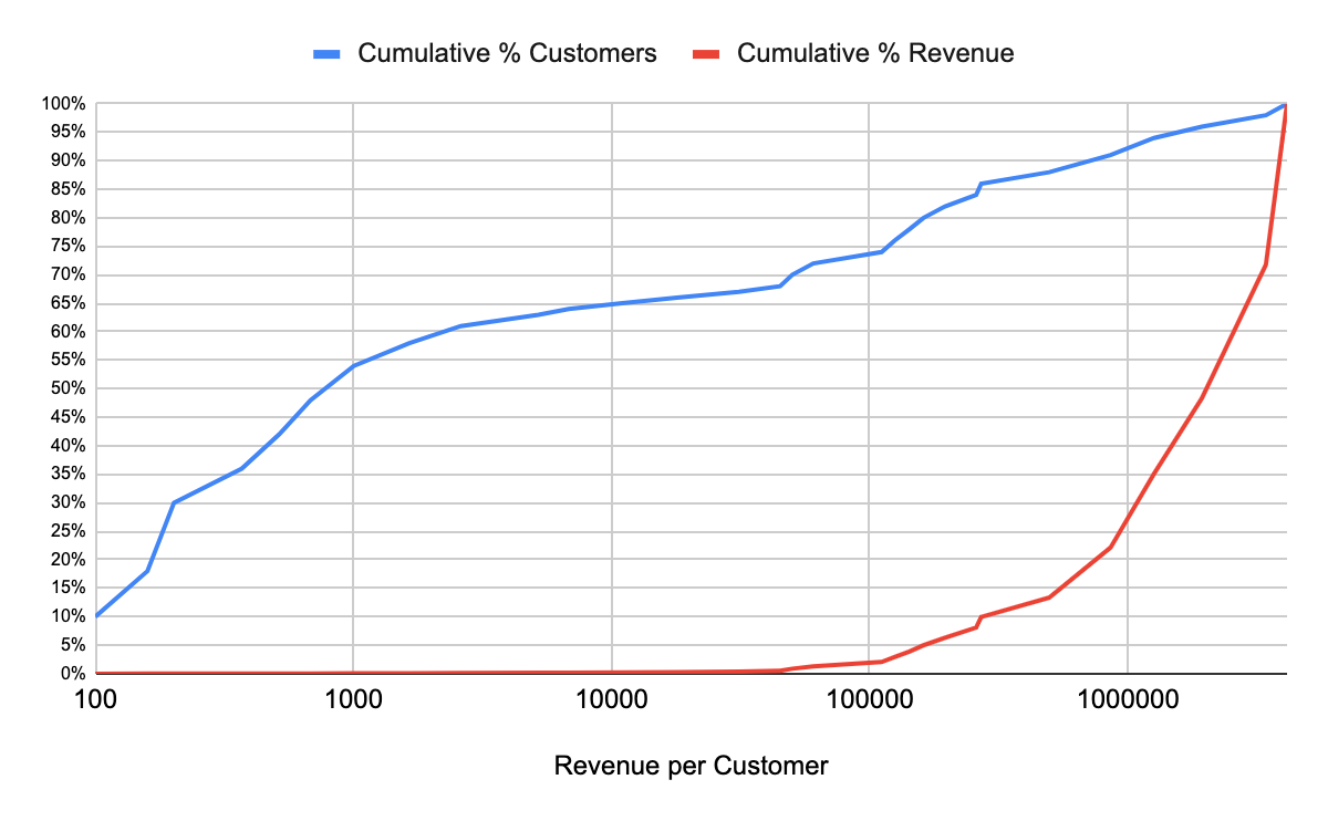
In the next graph, we will plot cumulative revenue as well.
Quick observations from this graph are:
Around 55% of customers contribute to less than 1% of revenue. In fact, 75% of customers contribute to less than 5% of revenue
Top 10% customers contribute to >80% of revenue
Sounds good?
Now let me ask you a different question. Given that the top 10% of customers contribute to > 80% of revenue, should you be worried?
Well, depends on the scale. Suppose you are in an early-stage SaaS business with 20 customers, and your majority of revenue (80%) comes from 2 customers. In that case, there is a greater risk to your business if those 2 customers go away. If you are late-stage and have 1000s of customers, not so.
Just as we have analyzed revenue, we can analyze engagement in minutes. You can get a lot of useful insights about your power users by doing so.
With this, let me conclude this week’s post. Next week, we will cover growth projection models.
Have a good Sunday!
Sincerely,
Deepak







Is the retention chart (the one you get from mixpanel ) different from L30 power user chart you described here ? Is so, how?