Last week, we discussed what Onboarding is, why it matters for the growth of a product, and how we should think about it for a spectrum of products.
For the new ones here, do check out the other posts that I have written if you haven’t
3,000+ people have subscribed to the growth catalyst newsletter so far. To receive the newsletter weekly in your email, consider subscribing 👇
If you aren’t familiar with the newsletter and online sessions, you can read about it here
Off to the topic,
This week, we will explore how to build the right onboarding experience. But first, what holds us back from building the right onboarding experience?
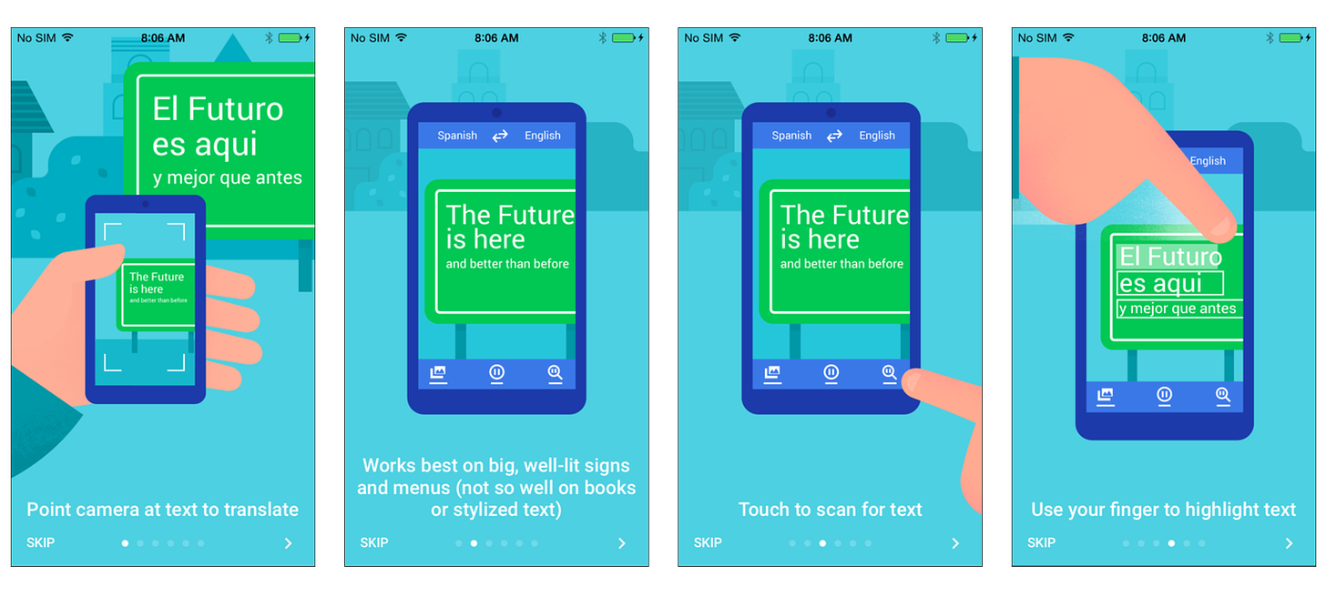
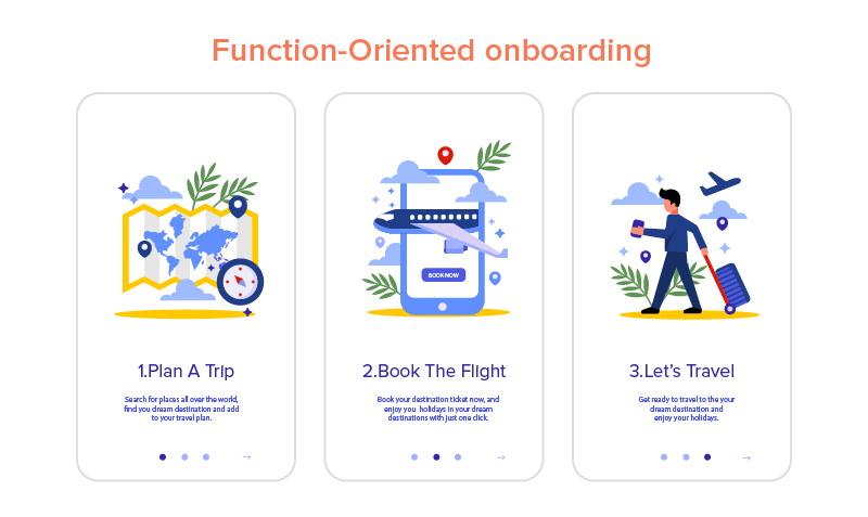
Definition of Onboarding! A lot of PMs and Designers I have met define onboarding as a tool to educate users about different features of the product. This is the reason they use the Onboarding slider telling users what to do. Here is an example from google translate where it shows the instructions around how to use the app.
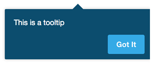
Few others have developed their fondness for tooltips
It would be wrong to say the tooltips and sliders don’t help. They are generic tools of Onboarding used by many products out there. But like many generic tools, they make a tiny difference compared to what the right onboarding experience can do.
Let’s extend the definition of Onboarding to “getting users to their Aha! moments”. Before we start, this is a long post and might be truncated in email. Go to the deepaksingh.substack.com to read the whole of it.
Working Backwards
Amazon has this famous ‘working backwards’ approach to building products. Ian McAllister, a longtime Amazonian, wrote about it on Quora
There is an approach called "working backwards" that is widely used at Amazon. We try to work backwards from the customer, rather than starting with an idea for a product and trying to bolt customers onto it. While working backwards can be applied to any specific product decision, using this approach is especially important when developing new products or features.
For new initiatives a product manager typically starts by writing an internal press release announcing the finished product. The target audience for the press release is the new/updated product's customers, which can be retail customers or internal users of a tool or technology. Internal press releases are centered around the customer problem, how current solutions (internal or external) fail, and how the new product will blow away existing solutions.
If the benefits listed don't sound very interesting or exciting to customers, then perhaps they're not (and shouldn't be built). Instead, the product manager should keep iterating on the press release until they've come up with benefits that actually sound like benefits. Iterating on a press release is a lot less expensive than iterating on the product itself (and quicker!).
We can adopt the same approach for building the Onboarding experience. The idea is to start with defining the Aha! moments of the product and build it back from those Aha! moments.
The first step to this is identifying the Aha! moments for your product.
Identifying Aha! Moments
Every product has a different Aha! moment(s). To identify these moments for the product, let’s start with the end-users.
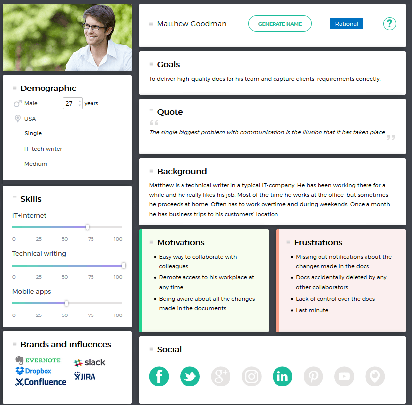
A consumer product can have millions of users. How do we think about what millions of users want? We start by categorizing these users basis a few key characteristics. In the world of product and design, these categories are called user personas. A persona is a collective image of a group of customers who have similar behavior or characteristics.
This is how a user persona looks like
We have been taught that every human being is unique. What’s also true is we are similar in a lot of ways. A user persona exercise tries to find those similarity patterns and groups the users.
How many personas should be there? After all, there are billions of people on this planet and you can come up with hundreds and thousands of personas if you want. We should create 3-8 user personas for the product as they often cover most of the end-users for the product. More than 8 is overkill.
Once we have these personas, it’s easier to identify Aha! moments for each of them. A single ‘Aha! Moment’ can apply to most or all of the personas as well. An example of this is finding 7-10 friends when you join a social network like Facebook. It will be hard to find a person who doesn’t like that. This is why People You May Know was such a huge success for Facebook as we discussed in the last post.
Step 1: Identify 3-8 user personas for your product
Step 2: List down their Aha! moments when they will use your product.
If you can’t come up with Aha! moments in your product, you most likely don’t know the consumers well. You will have to talk to these potential users and figure out whether they need the product you are building or not. Most of the successful products have very clear aha! moments as you can see.
Assuming we have the personas and Aha! moments, how do we design the onboarding experience? If you aren’t a designer, it will bee hard to design one for yourself. What I am going to give you is a good list of elements of Onboarding. Treat it like a mental checklist that you have to think about in discussions around Onboarding.
Tools of Onboarding
There are multiple tools of Onboarding. We will cover 5 key tools of Onboarding. These tools should be used to take users/customers to their Aha! moments.
1/5 — Use the AIDA Model to Explain Benefits
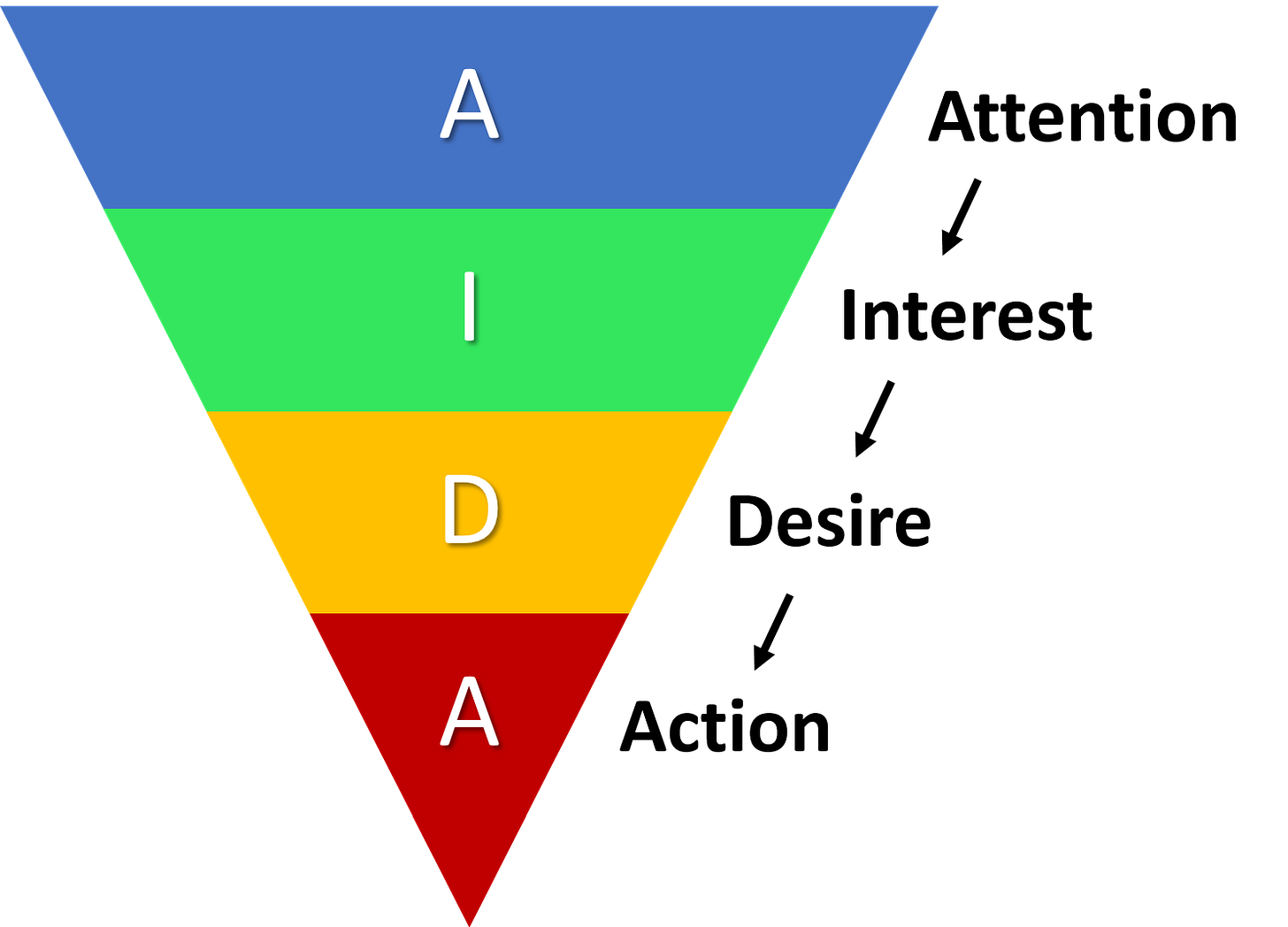
AIDA model is a concept taught in marketing classes. When a user opens your app or website, they follow the AIDA journey as shown by the diagram
Attention — Grab their attention
Interest — Show them something interesting
Desire — Once they engage, show them something they want/need
Action — Give them a call to action and a reason to act on it
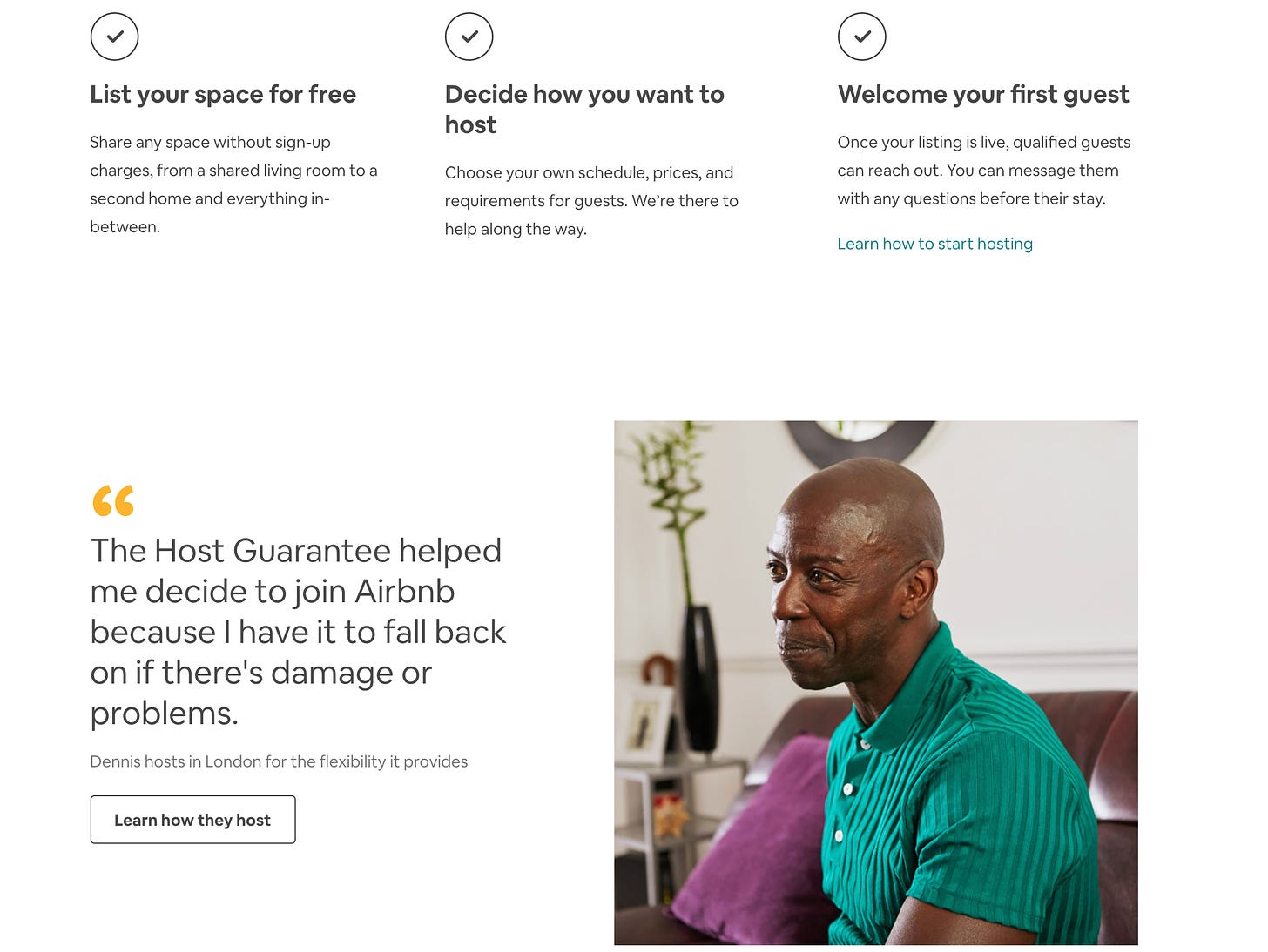
Normally, the AIDA model describes the steps a customer goes through in the process of purchasing a product. But it can be applied to all products. Almost all the good landing pages are created following the AIDA model. Though one thing to remember is that it doesn’t happen one by one in Internet products, but all at once. Let’s take the landing page of the Airbnb host page.
A — The picture on the top of the page gets you curious. To grab attention, all the landing pages have pictures.
A/I/D — The top fold of the page gets you interested in a clear callout “Earn money as an Airbnb host”. Earning money is a desire almost everyone in the universe has.
A — The action here is “get started” by telling a little about your place.
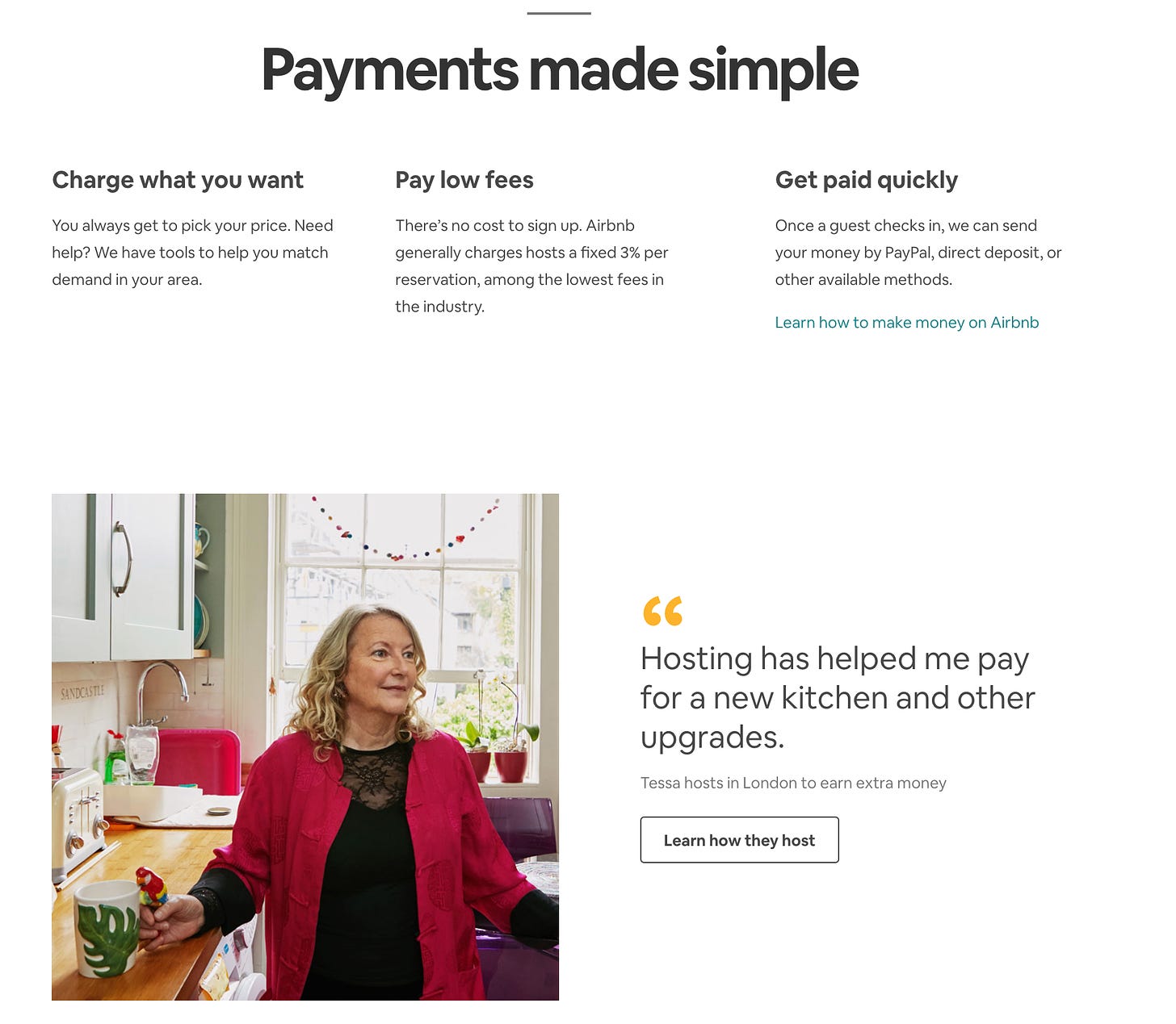
You can see AIDA on all the good landing pages. A better landing page tries to give multiple reasons to invoke interest, desire, and action. If you scroll down the Airbnb landing page, you will find a different CTA every fold and benefits listed clearly to increase interest and desire.
Airbnb providing assurance
CTA to learn how they host, multiple benefits
You get the idea!
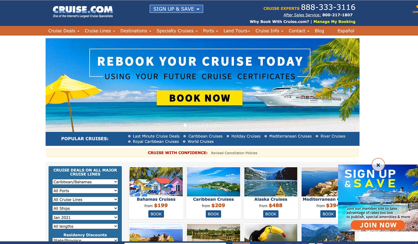
A bad landing page will look something like this. This was the landing page of Cruise.com a while back.
A lot of info with no clear action. Fortunately, they took note and improved it
So remember to include elements of AIDA next time you design your landing page or promotions page. Please note that the benefits should be explained before the signup/login happens. What do we do once we have convinced the user about the benefits?
2/5 — Progressive
A lot of apps want to explain the function of the app so that users can use it. These apps either fall into a new category or are complex with many features. Most of them solve this problem through sliders.
This approach has disadvantages. One, the users don’t want to read a lot of information, and two, they can’t remember it all.
A good onboarding experience is progressive. In general, people learn best by doing something. Progressive onboarding is presenting information gradually to users as they use the app. It avoids information overload for users and is very effective.
If you have to learn about progressive onboarding, there is nothing better than video games. Video games get complex over time. If someone opens a video game they have been playing for the last few months and shows to a friend who hasn’t played it once, the friend will find it hard to understand the game.
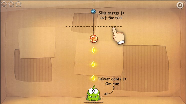
Video games break the complexity and teach them one by one to the users. Let’s take Cut the Rope as an example. The game is pretty popular with 100 mn+ downloads. It gives you an option to swipe and cut the rope just like in the game. They could have opted for screenshots to tell you this, but learning by doing is more delightful and effective.
Over time, they give you an option to toggle the gravity. They will present this option when you have mastered the first few levels. This is an example of progressive onboarding.
Another thing to remember while building progressive onboarding is to explain the benefit of the tasks.
In apps, progressive onboarding is especially useful when pointing out hidden functionalities that only power users would want to use. So if you are building a complex app with too many features, don’t despair. Just do progressive onboarding.
If the app isn’t that complex, say Youtube where the user just has to play a video, you don’t need progressive onboarding.
3/5 — Personalised
Creating personalized onboarding, you can reduce the drop-offs in Onboarding. The personalization can happen by asking for explicit info from the user and customize onboarding.
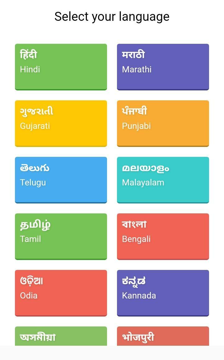
Suppose you are building an app in India where people speak 22 different languages across India. If your app is available in all languages, it is better to ask the user upfront which language they want to use when they open the app.
You can provide the rest of the experience in the language selected by the user.
4/5 — Managing the psyche of the user
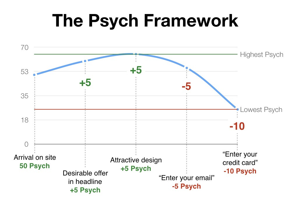
Psych framework written by Darius Contractor is one of the best thing I have read in Onboarding. Every UX interaction on the page increases or decreases Psych. The higher the psych, the more the motivation.
Once you understand which things increase or decrease motivation of the user, you can design your page to optimise for Psych.
Putting pricing between user testmonials and benefits is one way to optimise Psych. Once you start thinking like it, it becomes easy to understand and eliminate friction points.
Always remove friction, as much as possible!
5/5 — Behavioral tools
Humans are social animals. We rely a lot of authority figures and people around us when it comes to making decisions.
It is important to add social proof and authority to build trust with users.
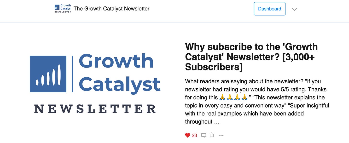
Social proof — consumers are heavily influenced by the actions and recommendations of others. Ratings, reviews, # of paid customers etc. are some of the examples of social proof. Here is the social proof I have used on the home page of this newsletter, mentioning 3000+ subscribers
Authority — When someone in authority like the givernment, celebrities, newspapers, CEOs speak about something, we tend to trust them more. Examples of authority can be seen in testimonials on books, yelp ratings in a restaurant and also on websites. Here is a review section of the book ‘The Psychology of Money’
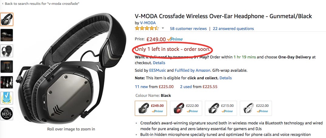
Scarcity — Scarcity is telling people ‘only few left in stock’ to create a sense of urgency. Amazon does this well
Research
You can design a good onboarding experience through identifying user personas, their Aha! moments and tools.
What you can do beyonds this is understanding UI design patterns of competitor apps by going through them.
Some common UI design patterns for Onboarding are — welcome messages, tooltips, progress bars, checklists, hotspots, action-driven tooltips, videos, slider. Here is a good resource to learn about these elements if you want to.
Researching apps in your domain can often give ideas you can’t imagine sitting and thinking :)
Re-engage
The last step of Onboarding is giving users reasons to re-engage. There is a good chance that even after doing everything right, few users wouldn’t find their Aha! moments in the product.
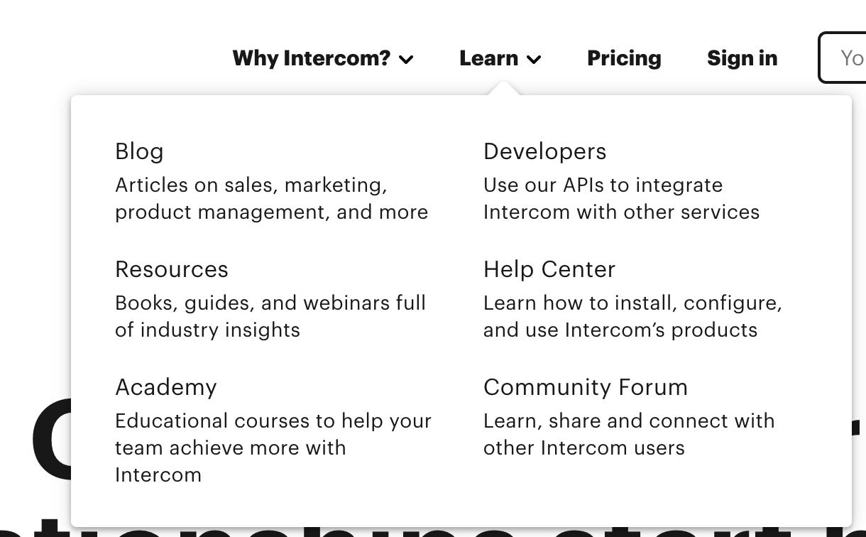
You can re-engage them by building things of value. Let me give an example. Suppose you went to intercom.com to check for a customer support chat solution. You couldn’t make the decision then, but found good resources for learning product marketing.
You keep coming to it once every month to read the articles. One day, you went ahead and checked few more things about intercom and found something useful in their product you hadn’t noticed the first time.
This is the value of re-engagement. It gives your product multiple chances to re-engage users and introduce aha! moment.
Sustainable ways to re-engage are
Content — users keep coming for reading and researching
SEO — you keep appearing in google searches of the users
Social — they keep seeing your posts on social media
To sum up, you can build an amazing onboarding experience by
Identifying 3-8 user personas for your product
Mapping Aha! moments for these personas
Using the 5 tools of onboarding — AIDA, Progressive, Personalised, Psych, Behavioral
Researching apps in your domain
Building ways to re-engage users
Now you may have some questions around onboarding, listing down the useful ones. Please feel free to comments any other questions you may have.
Q: Do products succeed despite terrible onboarding?
A: Yes they do. This happens especially when there is lack of competition and the pain of figuring out the product is lesser than the benefit of using the product. A prime example of this is the IRCTC website in India. Despite horrible experience, it is the only way to book train tickets in India. So people use it.
Very simple products with a single functionality also don’t need onboarding as users downloading this app already know the prime utility they offer. Example — Netflix, Youtube, Whatsapp, Google search
Q: Can I bring the ‘Aha! Moment’ through slider onboarding?
A: You can. If you have a very strong value proposition and the app is simple to use, you can bring the ‘Aha! Moment’ through slider onboarding
Q: Can I use the data and machine intelligence (AI/ML) to personalize onboarding
A : Mostly you can’t. You will have a cold start problem as you don’t have any data from the user.
Q: What’s the difference between a landing page and onboarding?
A : A landing page is the advertisement of your product. Onboarding is the user manual
Q: When does the onboarding stop?
A: Never
Q: Can we use ads and emails as an onboarding tool?
A: Ads are an expensive way to educate users about the product value proposition. But it works when it comes to expensive SaaS products as you can afford to show higher frequency of ads to the end users.
With this, I will wrap this already-long post. See you next week.
Happy Sunday ✌️
Haven’t subscribed yet? 😯 Consider subscribing 👇
Sincerely,
Deepak








I just want to say thanks to share this blog.
What is the different between personas and personalised.
Say I have 5 personas of clients . How do i have different personalised content for these 5